Appearance
Analytics: Overview
The Overview tab compares readings across devices and time. One filter card at the top drives every chart on the tab, so you choose what to look at once.
Open Analytics in the sidebar. Overview is the first tab.
Who can see it: everyone, for the devices they have access to.
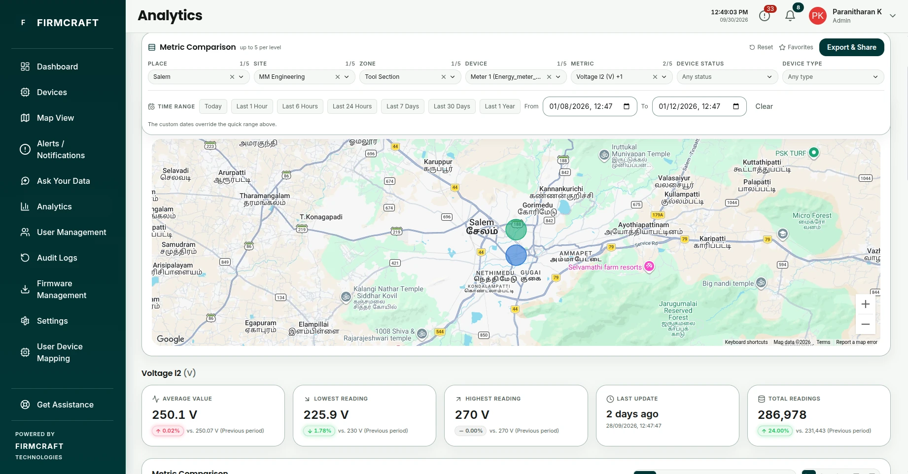
1. Choose what to compare
The filter card stays at the top of the page as you scroll. Work down it from left to right:
| Filter | What it does |
|---|---|
| Place, Site, Zone | Narrow down to one location. Each list only offers what's inside the one before it. |
| Device | Pick one or more devices. |
| Metric | Pick one or more metrics, such as voltage or temperature. |
| Device Status, Device Type | Optional. Narrow the devices further. |
| Time Range | Click Today, Last 1 Hour, Last 6 Hours, Last 24 Hours, Last 7 Days, Last 30 Days or Last 1 Year, or set your own From and To. |
You can pick up to 5 items at each level. The charts stay empty until you've picked at least one device, one metric and a time range.
2. Read the results
| Card | What it shows |
|---|---|
| Device Map | The selected devices on a map. |
| Summary tiles | Totals for the period, such as Total Consumed, Average Value, Highest Reading, Lowest Reading and Total Readings. |
| Metric Comparison | One chart per metric, with every selected device in it. A readings table and a heat map comparing this period with earlier ones are also available. |
| Device Uptime | How much of the period each device was online. |
| Alert Distribution | Alerts in the period, By Severity and By Status. |
| Device Performance | Each device summarised separately for each metric: average, extremes, alert count and uptime. |
Save a favorite
If you look at the same selection often, save it:
- Set up the filters.
- Click Favorites on the filter card and choose Save current filters….
- Give it a name.
Pick it from the same menu later to restore every filter at once. Favorites are saved to your account, so they follow you to any computer, and the first five are included in the weekly report.
Export and share
Click Export & Share on the filter card:
- Export as PDF: a printable report of what's on screen.
- Export as interactive HTML: a single file with working charts, to email to someone without a Firmcraft IoT Dashboard account.
- Export as CSV: the raw readings, for a spreadsheet.
The export always matches your current filters.